Corporate Identity
- Red Dot Design Award Winner 2021
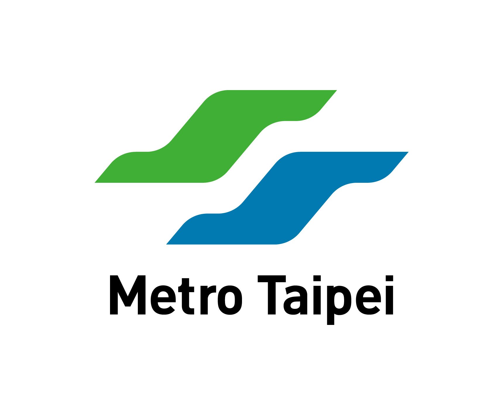
- Logo Design
The new logo defies the challenges typical of a redesign by freeing up space and enhancing the original by adding rounded edges and flowing lines, giving it a more polished look while still retaining elements that make the brand recognizable. The proportional blank space left between the blue and green stripes symbolize the smooth accessibility of the Taipei Metro; the metro is also receptive to a wide array of diverse information, interweaving this knowledge with its transit system to form a comprehensive urban living network. Additionally, the new design also simplifies the edges and details of the logo, taking care to heed the balance and quality of the overall layout while also adapting to the flat logo trend of the digital age, granting new life to the logo so that it can bridge the gap into the next era. - Logotype Design
The logotype is a breakaway from the previous iteration’s depiction of speed. It reclaims the rhythm and beauty that exists among vertical and horizontal strokes, presenting its charm in a calmer, more controlled fashion. The strokes are designed to be smoother and more fluid, echoing the brand’s core identity and enhancing readability, with a focus on achieving a balance between the layout of the logo image and text. - Dynamic Branding
This concept originated from the movement of the trains and their approach to stations; we hoped to take the initial bidirectional energy of the original logo’s image and merge it into one cohesive motion. Furthermore, in light of the growth of digital customer interactions, variations of the logo open up even more possibilities for the brand on digital devices, thus establishing a deeper connection with the general public. - Corporate Colors
By adjusting their brightness and chroma, the blue and green in the brand logo have been made more harmonious; their colors seem more consistent and connected, just like how Taipei Metro closely links together daily life and information. They are subsequently more suited for use on light, dark, or all manner of backgrounds. - Auxiliary Graphic Scheme
By harnessing the fluidity and versatility of the brand logo, we’ve come up with a highly modifiable auxiliary graphic scheme. The design elements within this scheme can be used to interact and respond to various prompts, capable of generating a myriad of visuals for the brand.

![Taiwan.gov.tw [ open a new window]](/images/egov.png)